3 Simple Ways to Make Your Blog More Readable
Here are some ways to make your blog stand out and easy to read!

I'm a solutions engineer lead, GitHub Star, Director of WomenDevsSG, and co founder of ragTech. I work at the intersection of tech, systems, and leadership, and this blog is where I share my journey through all three. Expect honest reflections, real experiences, and thoughts that are still forming rather than polished career advice.
As a technical blogger, it is important to ensure that your writing is not only clear and concise, but also easy to digest and read.
There are many ways to increase your article's readability and keep your readers on your article longer than the average 10-20 seconds. In this article, let's discuss 3 simple ways to make your blog posts more readable.
1. Paragraphs
Most of us are looking to read short yet informational technical articles. Hence, keeping your paragraphs short at around 2-4 sentences can prevent readers from perceiving your article as long-winded.
Plus, shorter paragraphs make it easier for readers to skim your article, so they can easily read and find the information they are looking for.
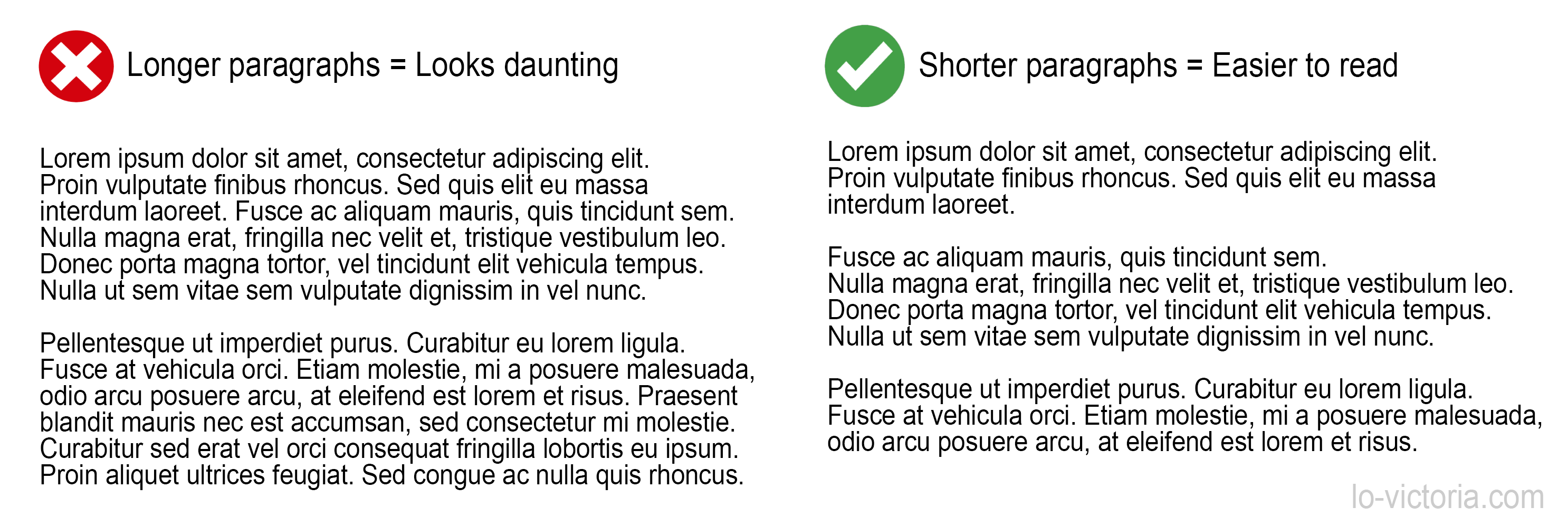
Sometimes, you can also use a single sentence in a paragraph to really capture the reader's attention on something you want to emphasize.
It really makes a difference!
By varying sentence lengths and keeping your paragraphs short, your blog posts will, without a doubt, look more reader-friendly.
2. Style
When it comes to increasing readability, a good typography is a simple yet very effective strategy. According to a font readability research conducted by Geniusee, the most readable fonts are sans-serif fonts such as Arial, Helvetica, Verdana or Adsans. Therefore, it is a good idea to use these more readable fonts.
After selecting a readable font, choosing a font colour will be just as important. It goes without saying, you should choose font colours that are contrasting with the background colour of the page. But don't overdo it and choose super bright font colours. It can tire the reader's eyes easily.
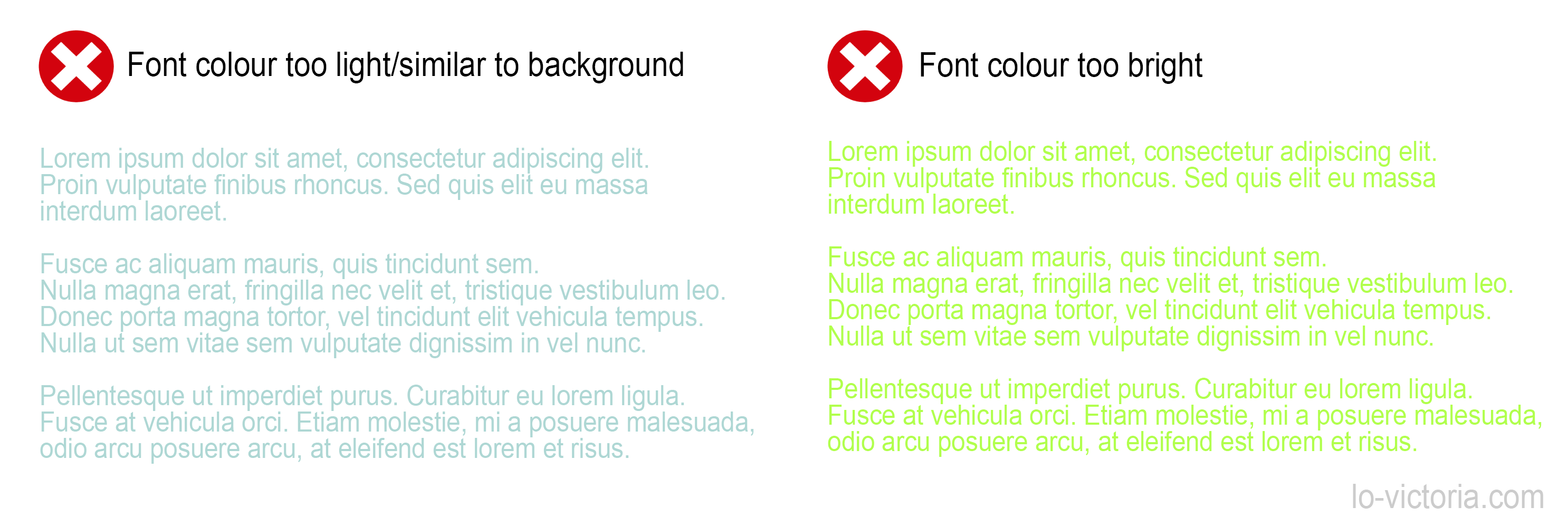
Most ideal colours are monotone, neutral colours like white, black, dark grey, etc.
In terms of other styling tactics, keep in mind to emphasize hyperlinks in bold or with an alternate colour to attract the reader's attention. Finally, keep your writing to left alignment, as it has been shown to be the most readable out of all possible alignments. Headers can be left or center-aligned as best practice.
3. Use headers wisely
Speaking of headers, it is crucial to use them as they were intended: to organize and navigate by topic. There are 2 main rules that I follow to use headers correctly.
The first rule in using headers is, don't skip levels. For example, a "h1" header must not be followed by a "h3" header. That being said, do not misorder the headers like having "h1" after "h2". "h2" elements must follow "h1" elements, and "h3" must be after "h2" and so on.
Next, do not style "p" with a large bold font and call it a header. Use the appropriate header elements from "h1" to "h6".
Following these 2 rules ensures that your content will be more accessible to people with disabilities or poorer vision. Also, good use of header can help you with indexing and better SEO.
4. Bonus tips, because why not?
In the previous section, I mentioned that good use of headers can make your blog more accessible. Another good practice for accessibility is to use alternative text (alt text) in your images. It is helpful in times when your images won't load or for readers with disabilities.
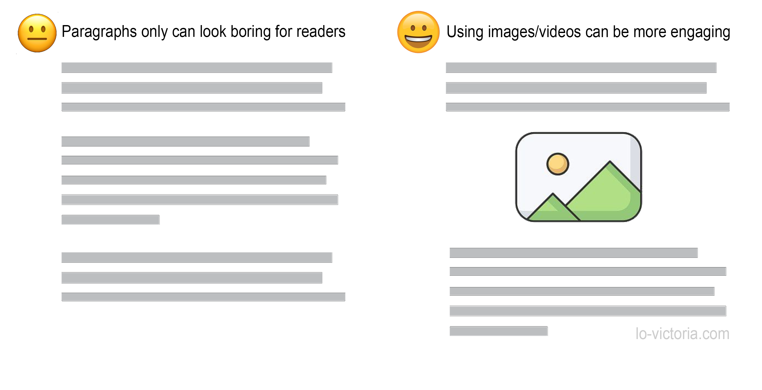
Improving the visual appeal and structure of your article can also increase readability, as it is easier to read articles with images or videos that break up long text rather than only mundane chunks of paragraphs.
Besides utilizing images or videos to make your article look more interesting, lists and bullet points can also be a simple tactic to please your reader's eyes and keep them engaged with the short and digestible points.
Conclusion
Ultimately, improving your articles' readability can keep your readers engaged in your blog longer. With so many other blogs out there, this is one way your blog can stand out and give your readers a reason to return for another article.
Thanks for reading, I hope some of these tips I have shared can help you increase your readers' satisfaction and grow your blog. If you have any questions, please feel free to comment below. Do share and like this article if it helps you in any way.
For more blogging tips, please check out my Blogging Tips series. Stay tuned for more and cheers!
References
- https://geniusee.com/single-blog/font-readability-research-famous-designers-vs-scientists
- https://blog.prototypr.io/text-alignment-best-practises-c4114daf1a9b